The foundation for everything you scale
bricks_dev
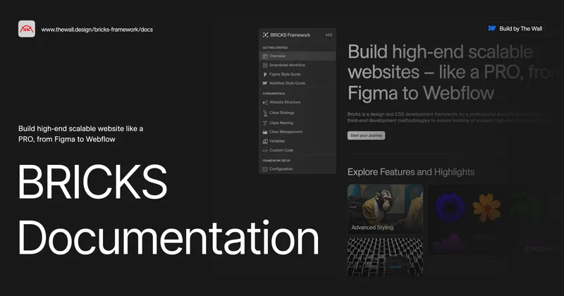
Webflow Style Guide
→
Build faster. Build stronger. Build with Bricks.

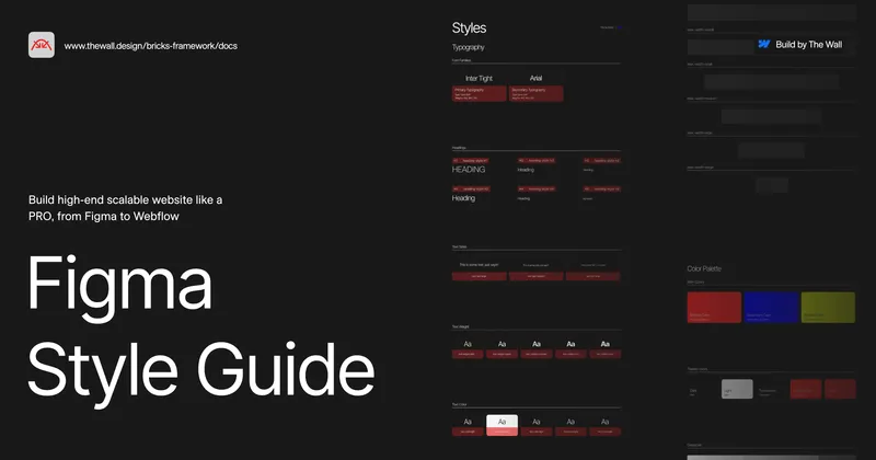
Figma to Webflow Workflow
News and Insights


FAQ's
Risk & Ethical Deployment
How do you ensure the AI agents maintain our brand voice and tone?
We deploy agents only after extensive, supervised training on your proprietary brand guidelines and communication history, ensuring output is always on-brand and authoritative.
How is the ethical risk (bias, data misuse) of a deployed agent managed?
We establish clear governance logs and monitoring tools to track agent decisions, allowing for immediate auditing and ethical correction before outputs can negatively impact the brand.
How is the security and privacy of the data used for agent training maintained?
We enforce a zero-retention policy on sensitive client data used for training. All proprietary data is encrypted, anonymized, and processed within a secure, isolated environment, ensuring it never leaves your control or our secure perimeter.
Technical & Workflow
What platforms or back-end systems can your agents integrate with?
Our agents are designed for maximum flexibility, integrating seamlessly with Webflow, all major CRMs (HubSpot, Salesforce), and custom APIs for true end-to-end automation.
How do we monitor the ROI and performance of a new AI agent?
We embed analytics to track performance against defined KPIs (e.g., conversion lift, time saved), providing a dashboard that clearly demonstrates the financial value of the AI deployment.
How does the multi-agent system prevent redundancy or conflict between deployed agents?
We utilize a centralized Agent Orchestration Layer that manages task assignment, prioritization, and communication between agents. This system prevents conflicts, ensures predictable execution, and maximizes resource efficiency.
Personnel & Training
Will AI integration eliminate our workforce?
No. Our focus is on workflow optimization, not elimination. We automate repetitive tasks to re-educate your team, redirecting human talent to high-value strategic work.
What level of internal technical maintenance will our team need to perform?
Minimal. The agents are managed through your centralized platform. We provide ongoing support via our retainer to handle maintenance, ensuring your team focuses purely on strategy and output.audits and training, ensuring ongoing education on current threat landscapes, with performance evaluations that specifically focus on security adherence.
What training is provided for the ongoing use and management of the AI agents?
We provide comprehensive training on the AI Agent's output monitoring and ethical usage protocols. This empowers your team to safely manage the agent's performance, audit its decisions, and ensure successful integration into your daily workflows.